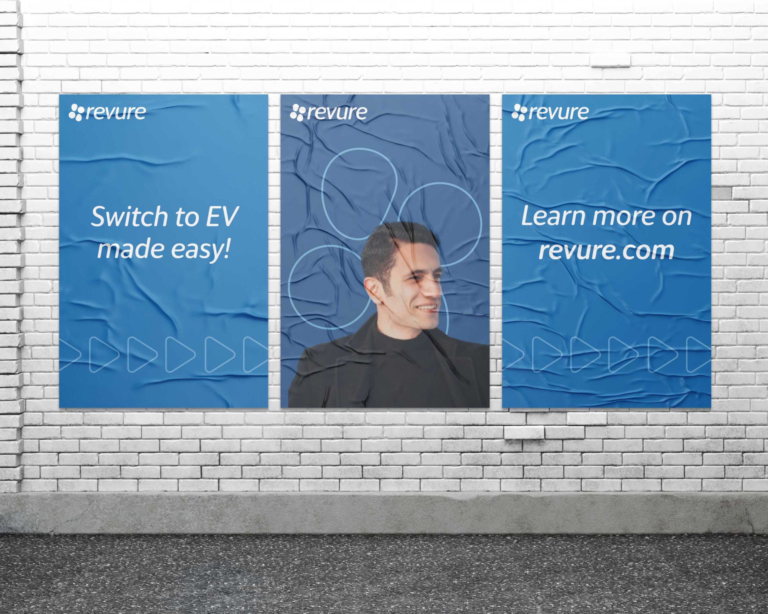
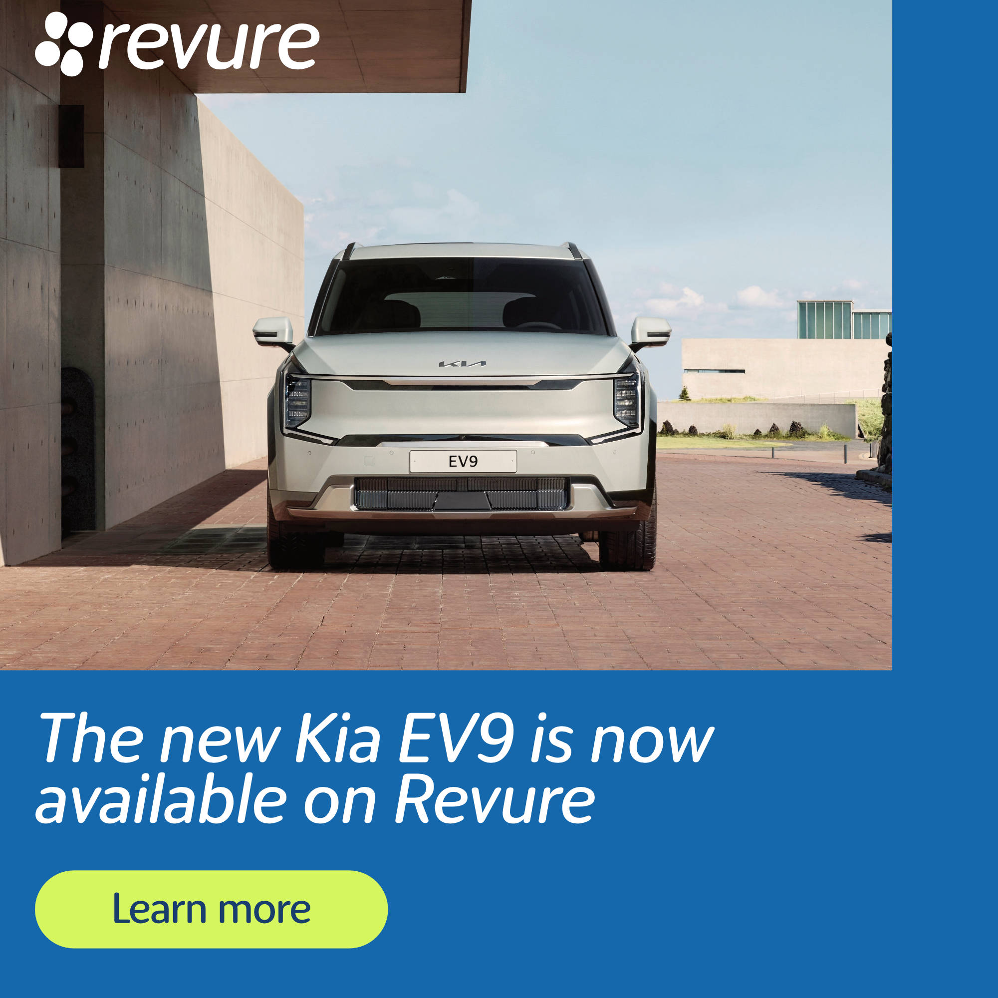
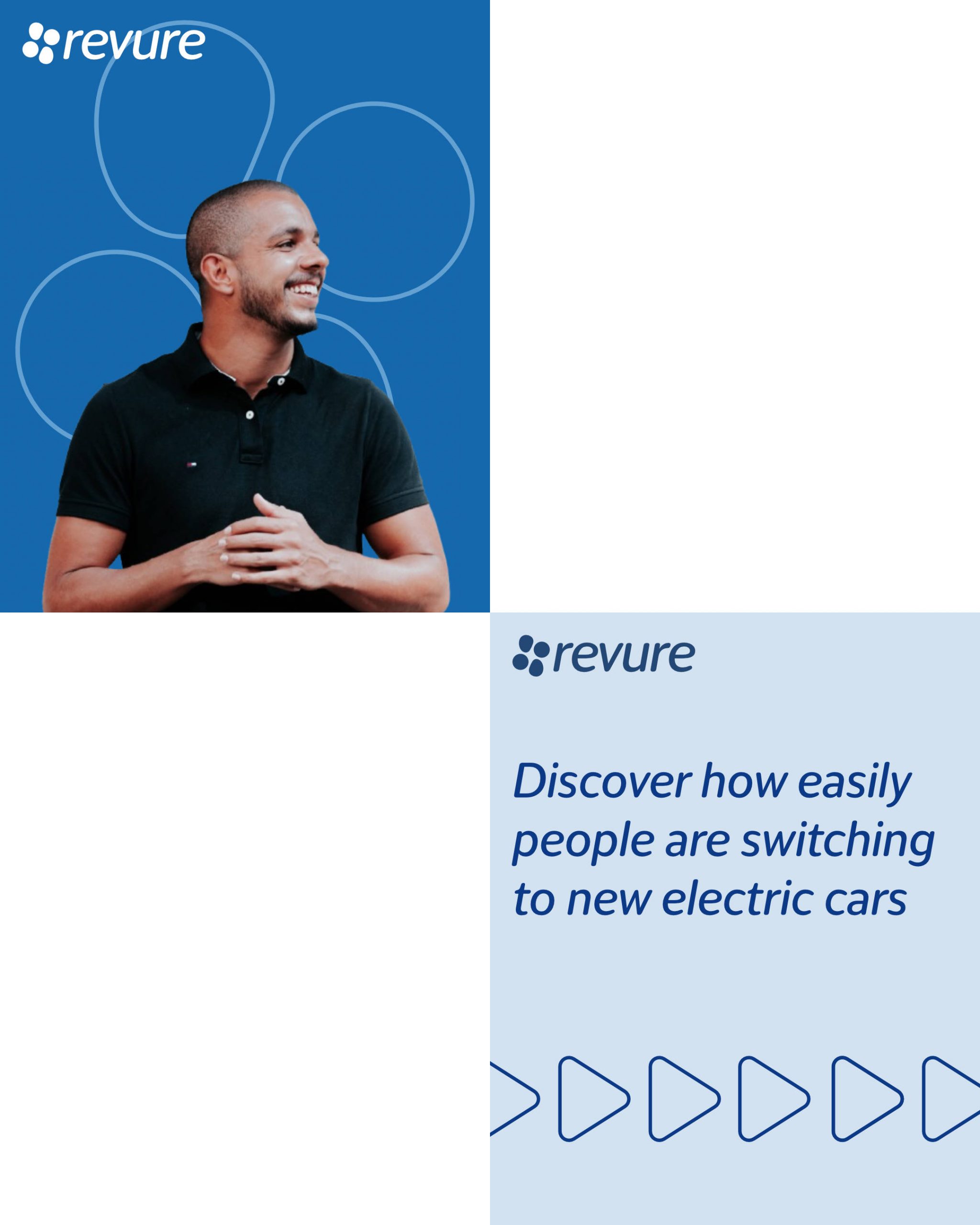
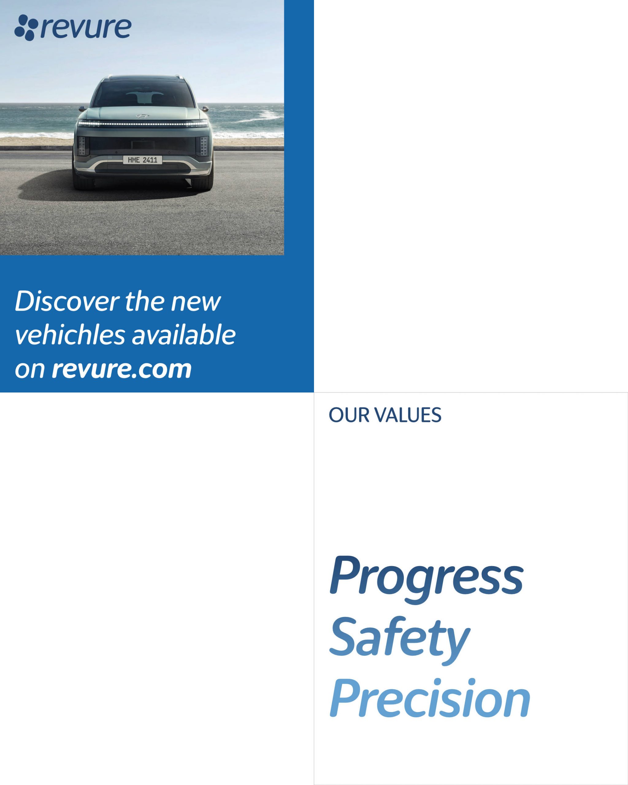
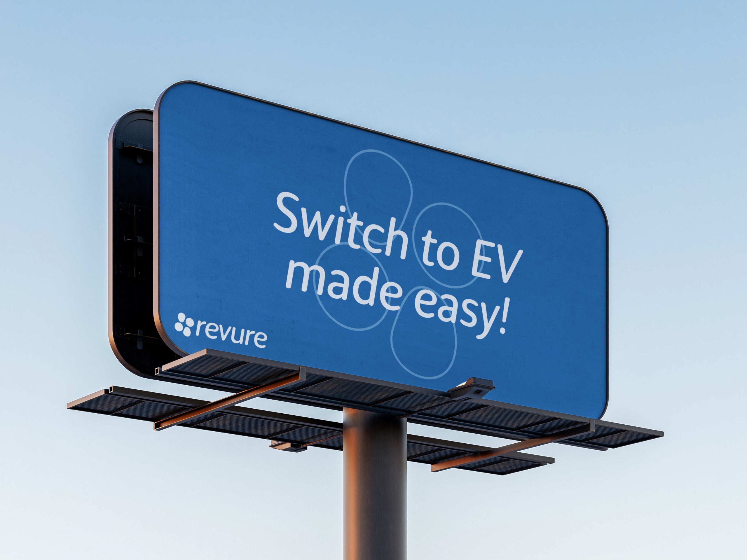
Revure
This is a brand identity concept. Revure, with the goal of simplifying the transition to electric cars, targets middle-aged individuals in the United States who are interested in adopting new mobility solutions but are concerned about costs, technology, maintenance, and ease of use.
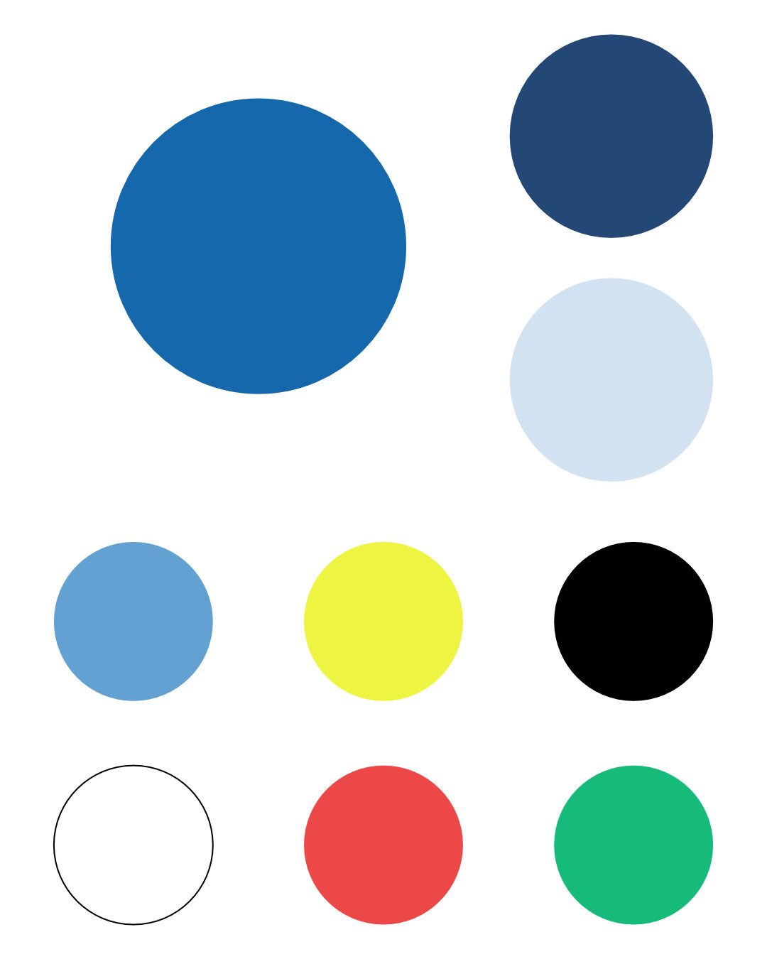
Based on target audience research I based the logo on the concepts of safety and evolution, it consists of two circles combined with two warped circles; the warped circles represent the new approach to mobility, while the classic and reassuring circles signifiy the safety guaranteed by the brand. “Revure Blue” is the main colour, a calm and reassuring shade of blue. The signature graphics feature the logo, the main colour paired with other calming shades of blue, arrows representing progress, innovative vehicles, and the target audience happy and looking ahead.